Conversant Media
At Conversant Media, we craft digital strategies that help businesses get found, trusted, and chosen online. Our team specializes in SEO services and PPC management, building campaigns that boost visibility, attract high-intent traffic, and drive measurable results.

Search Engine Optimization
Our SEO services are tailored to align with your business goals, ensuring your website ranks higher, loads faster, and converts better.

Pay Per Click Campaigns
Our PPC experts manage Google Ads and Bing Ads campaigns that maximize return on ad spend while giving you transparent reporting on every click, conversion, and customer acquired.

Digital Marketing
We combine proven SEO techniques with smart advertising strategies to keep your business visible, competitive, and future-ready.
About us
What You Need To Know About Our Company
Conversant Media is a results-driven digital marketing agency built on expertise, creativity, and trust. We specialize in SEO and PPC services that help businesses scale online with measurable impact. Our approach is simple: use proven strategies, leverage cutting-edge tools, and stay focused on delivering growth.
We believe in transparency, accountability, and long-term partnerships. Whether you need to improve rankings, lower ad costs, or generate more leads, we’re here to make it happen.
Scaling Your Business With SEO and PPC
For small to mid-sized businesses, competing online can feel overwhelming. Search results are crowded, advertising costs can spiral, and the digital landscape keeps changing. At Conversant Media, we help bridge that gap by combining search engine optimization (SEO) with pay-per-click (PPC) advertising — two of the most effective digital marketing channels for driving consistent, scalable growth.
SEO Matters for Small Businesses
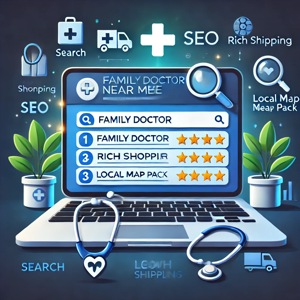
Search engine optimization is the foundation of online visibility. If your customers can’t find you on Google, chances are they’re finding your competitors instead. SEO helps your website rank higher in search results for the terms your audience is actually searching for — whether that’s “local plumber near me,” “best accounting software,” or “affordable marketing agency.”
For small and mid-sized businesses, SEO levels the playing field. A well-optimized website can compete against bigger players by targeting long-tail keywords and niche opportunities that bring in motivated buyers. Our SEO services cover every stage of optimization:
- Keyword research to uncover high-intent search terms.
- On-page SEO that makes your website clear, fast, and user-friendly.
- Technical SEO to ensure search engines can crawl and index your pages.
- Content creation that builds authority and answers customer questions.
- Local SEO strategies that get you seen in “near me” searches and Google Maps.
The Power of PPC for Faster Results
While SEO builds long-term visibility, PPC advertising delivers results almost instantly. With the right strategy, Google Ads and Bing Ads put your business directly in front of potential customers the moment they search for your service.
PPC campaigns are highly measurable and allow you to control budget, targeting, and audience intent. For small to mid-sized businesses, this means you can:
- Test new offers quickly.
- Drive targeted traffic without waiting for organic rankings.
- Retarget visitors who didn’t convert the first time.
- Scale campaigns that deliver the highest ROI.
When combined with SEO, PPC ensures your business is visible at every stage of the customer journey — from discovery to decision-making.
SEO + PPC: A Full-Funnel Growth Strategy
The real power comes when SEO and PPC work together. Here’s how the two complement each other:
- Keyword insights from PPC can shape your long-term SEO strategy.
- SEO improves Google rankings reducing dependence on paid ads and lowering acquisition costs.
- PPC ads can cover competitive terms where organic rankings are tougher.
- Combined reporting gives you a clearer picture of what’s working across channels.
For growing businesses, this combination means sustainable traffic, reliable lead generation, and better return on marketing investment.
Why Choose Conversant Media?
At Conversant Media, we specialize in building tailored digital marketing strategies for small and mid-sized businesses that want to scale. Our approach is straightforward:
- Focus on the channels that matter most.
- Eliminate wasted ad spend.
- Build SEO foundations that last.
- Use PPC to accelerate growth while organic traffic builds.
- Provide clear, actionable reporting so you know exactly where your money is going.
We understand that no two businesses are the same. That’s why our campaigns are customized to your industry, your competition, and your growth goals. Whether you need more phone calls, more store visits, or more online leads, our team builds the roadmap to get you there.
The Bottom Line
Ranking on Google and running effective ad campaigns shouldn’t be limited to big corporations with endless budgets. With the right mix of SEO and PPC, small and mid-sized businesses can compete, scale, and thrive online. Conversant Media is here to guide you every step of the way.